ICS – Industrial control system is the backbone of a process or plant. It involves operation components like open loops, closed loops, 3rd party communications, and critical parameters like fire & gas, ESD trips & shutdowns.
Operator interaction with operator station is focused on all above components’ operating & monitoring. Monitoring important parameters is a higher priority to maintain balance in the entire process establishment at the primary level.
Though panel operators are habited for quick response over parameter ups & downs, during process abnormality they can handle it very well, but each parameter variation may cause alarm flooding on the operator station.
Due to the flooding, the panel operator may miss some of the important alarms during process abnormality & it may increase the risk from small-scale to high scale production loss as well as big disaster causing financial as well as human life loss.
To maintain alarm generation, EEMUA 191 standard was published in 1999 and it is globally accepted for good practice of alarm management or can say alarm rationalization.
DCS Alarm Summary Dashboard
I’ve developed this Alarm Summary Dashboard using Microsoft Power BI which visualizes DCS alarms which is helpful to manage/rationalize alarms & make a healthy control system environment. Microsoft Power BI is a single-page visualization to explain a scenario.
The visualizations on a dashboard are generated from the dataset which is imported from in various formats such as Excel, CSV, SQL, or Web URL. DAX functions in Power BI make visualization more powerful, effective & time-saving.
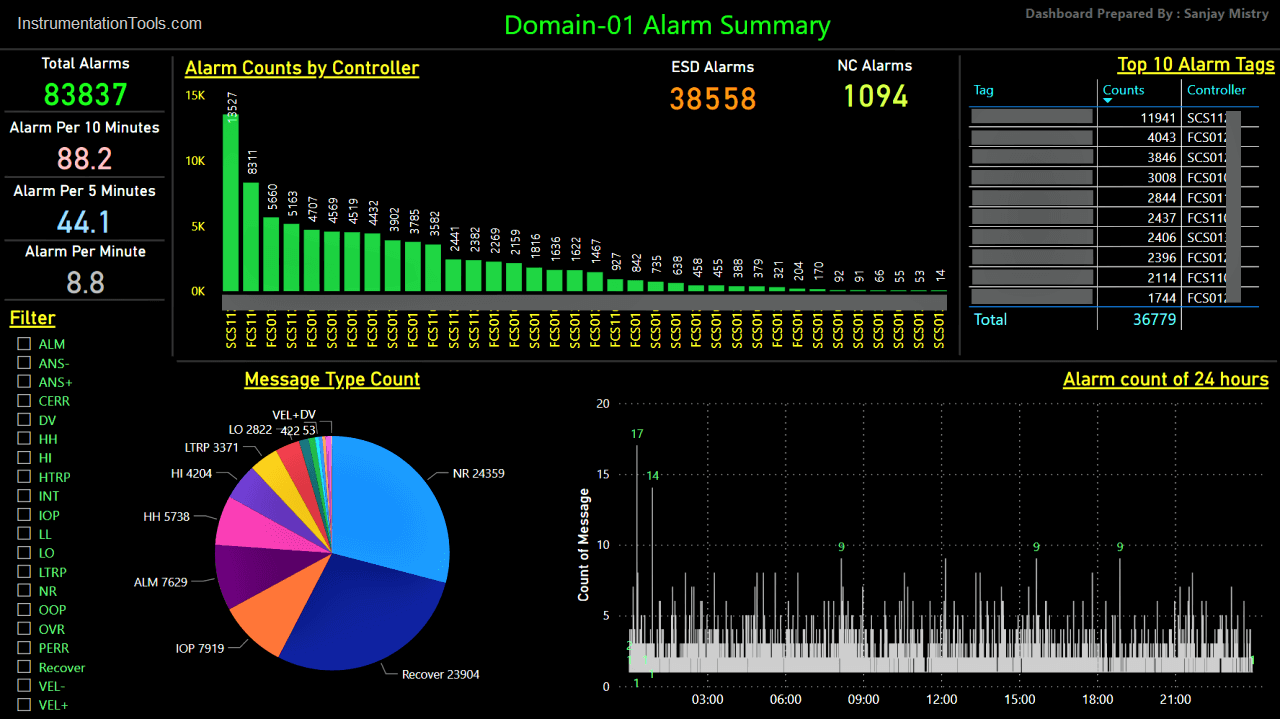
Here in this dashboard, we can import DCS alarms in excel or CSV format in Power BI and it will represent each visualization as per data imported. In this dashboard you can have:
- Alarm count summary: Total alarms, Alarms per 10/5/1 minute, ESD alarms & NC Alarms (Not connected/off-display alarms)
- Alarm counts by source controller
- Top 10 tags from alarms
- Alarm category type pie chart
- Alarm count plot of 24 hours
The most interesting thing is the dashboard is user interactive. It means it reacts as per filter selection on the dashboard. For example, if you select any alarm type from the filter available on the right bottom corner, it will refresh & represents alarm counts, controller, top 10 tags, 24 hours plot & pie chart.
Using this user interactive alarm dashboard, you can analyze alarms generation based on process parameter variation/deviation, loop issues, unnecessary alarms, field equipment error, repetitive alarms, logical errors, the recovery rate of parameter, process interlocks, Realtime-based alarm counts & most/least count of tags which as generating alarms.
This saves a lot of time of analyzing alarms and plan alarm rationalization in the most meaningful way (for both maintenance & production team) to maintain EEMUA 191 standard resulting in better process stability, and so better performance of ICS by decreasing load on the controller as well as ICS network by removing unnecessary alarm flooding.
In addition, I’ve prepared this dashboard in a dark mode which is a famous trend for user interface nowadays.
Thanks to Microsoft for such a powerful tool ‘Power BI’
(Year, Tags & controllers in the image are hidden to respect the data privacy)
I hope this may be helpful for you & your feedback will be appreciated, it will be helpful for my upcoming article contribution.
Author: Sanjay Mistry
If you liked this article, then please subscribe to our YouTube Channel for Instrumentation, Electrical, PLC, and SCADA video tutorials.
You can also follow us on Facebook and Twitter to receive daily updates.
Read Next: